Slashers: Icons of Horror
Background
The objective of this speculative project was to design the visual identity of a museum exhibition on the history of slasher villains. I created a logo that could be used for various purposes, as well as an exhibition book that could be purchased by visitors.
Logo Development
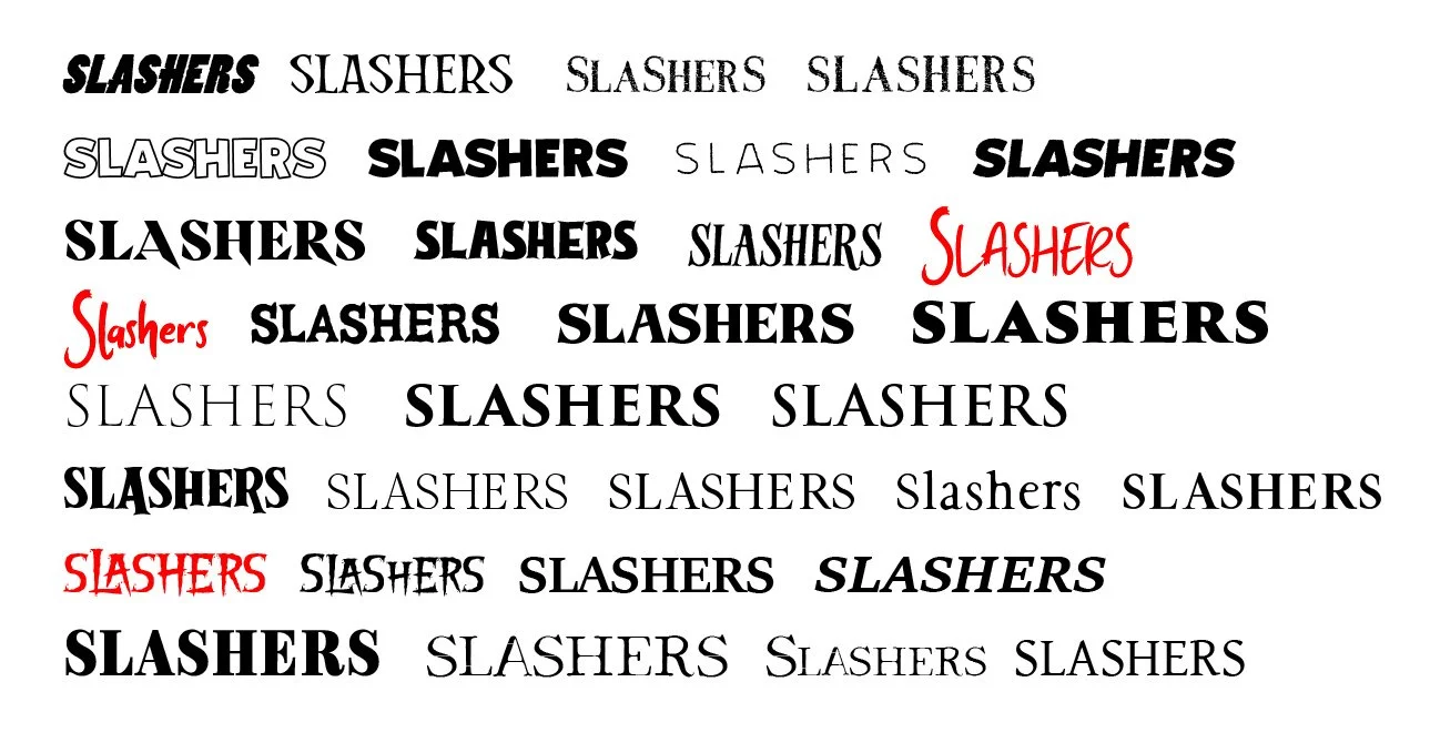
Though the slasher genre has its origins in early cinema, it really took off in the 80s and beyond, so I wanted to create a logo that was both inspired by classic horror movie posters (I searched for the original typefaces used in iconic movies like The Texas Chainsaw Massacre and Scream), as well as adhered to the conventions of modern recreations of the style with things like legibility in mind. My research also revealed that many modern horror movie exhibitions make use of altered, angled, and distorted typography, so I wanted my primary logo typeface to have characters that I could easily resize and refit when working through typographic solutions.
Above: the word “Slashers” in various horror themed typefaces
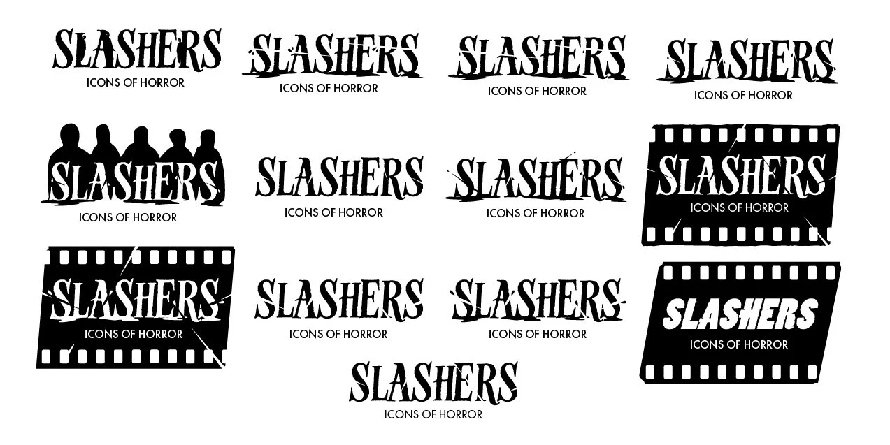
There are a lot of tropes in horror logo design that were appropriate for this exhibition. For instance, letters soaked in blood, stepped on, worn out, or cut up by slash marks. As I explored these tropes, I struggled to create something that was new and indicative of this specific exhibition and not its competitors. The theme of this exhibition was “Icons of Horror”, so I had to find a way to incorporate the icons into the design. I tried using silhouettes, but they would either be nonspecific or overly detailed. Eventually I came up with a solution that was synonymous with horror icons in a subtle way: putting the type center screen, or in this case, center film cell, the shared domain of all of cinema’s most iconic characters.
Above: Logo design exploration for Slashers: Icons of Horror
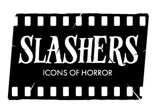
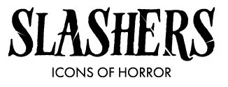
Above: Finalized logo variants for Slashers: Icons of Horror
Above: book page layout sketches
Book Design
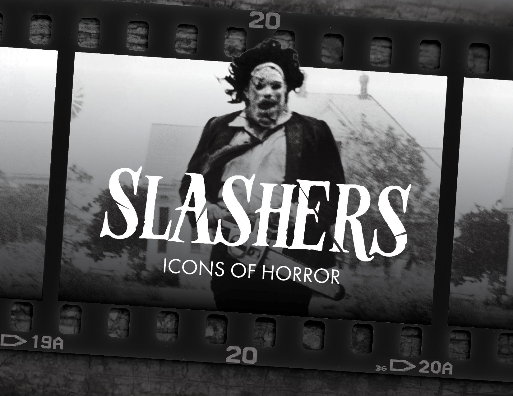
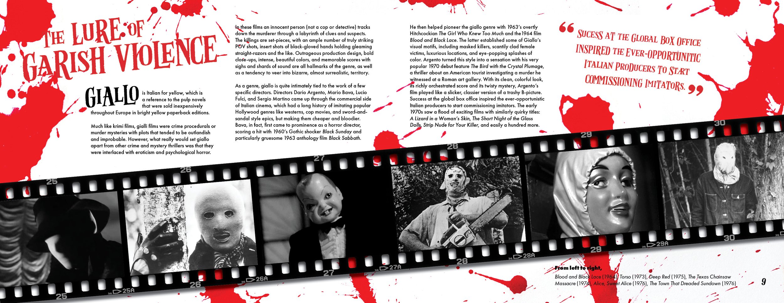
This was my first time designing a book, and I initially made the mistake of looking at each of the pages as distinct from one another rather than finding a through-line between them. I would finally understand what direction to take when I started looking at the book like a movie. Guillermo del Toro once said, “the first image (of a film), tells you the tone and theme", so I based my book cover off of my logo design, as it was made to encompass the tone and theme of the exhibition. I designed the book as a journey into an old celluloid film strip, with an introduction that intrigues the audience before pulling back to add contextualizing information.
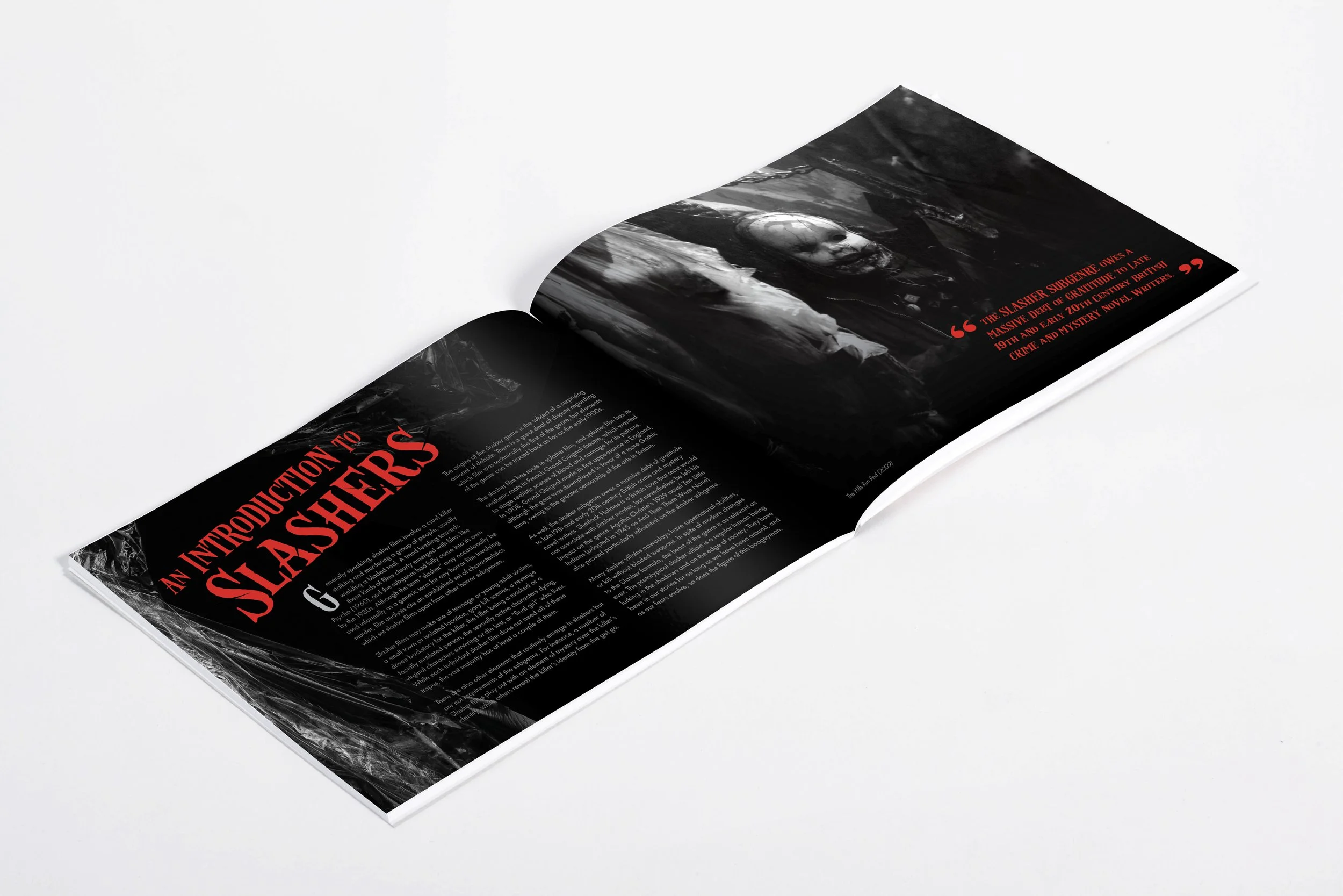
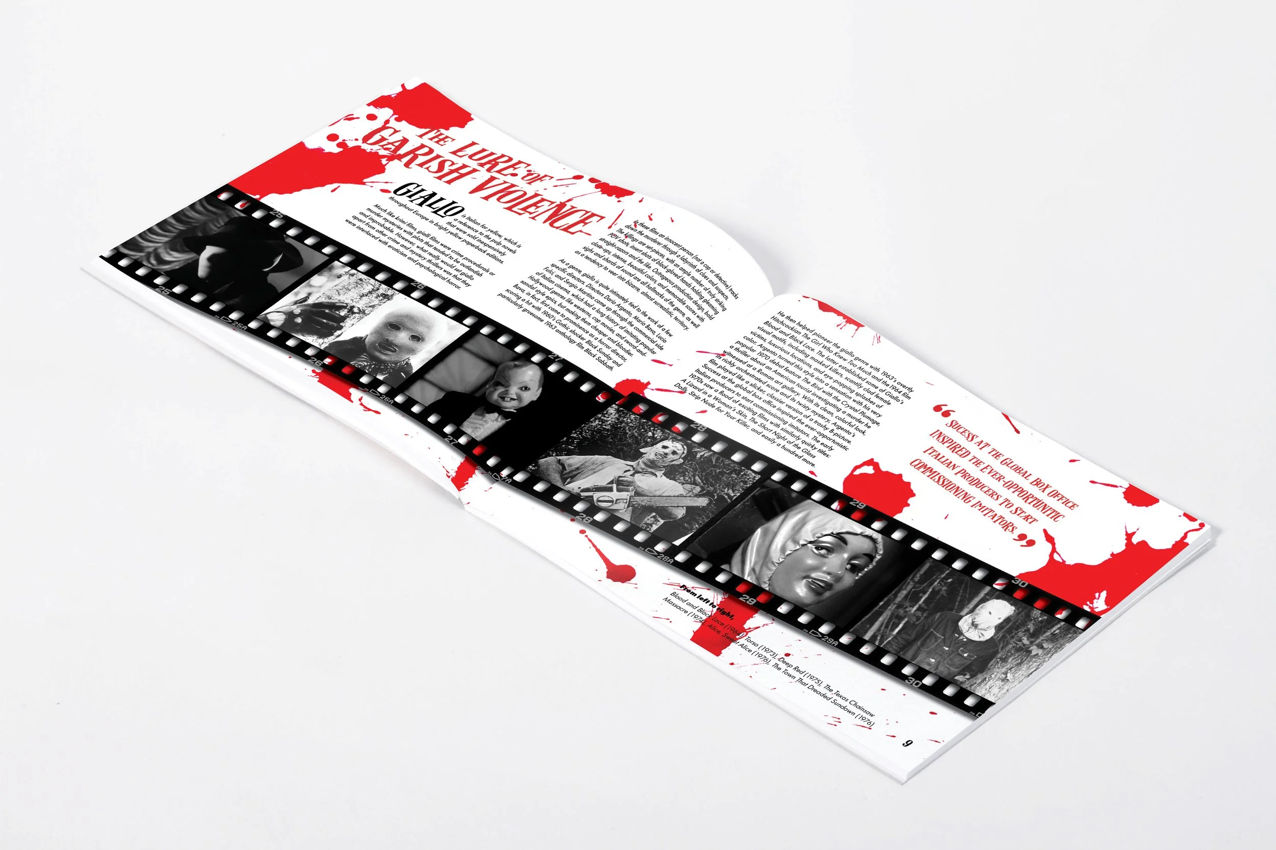
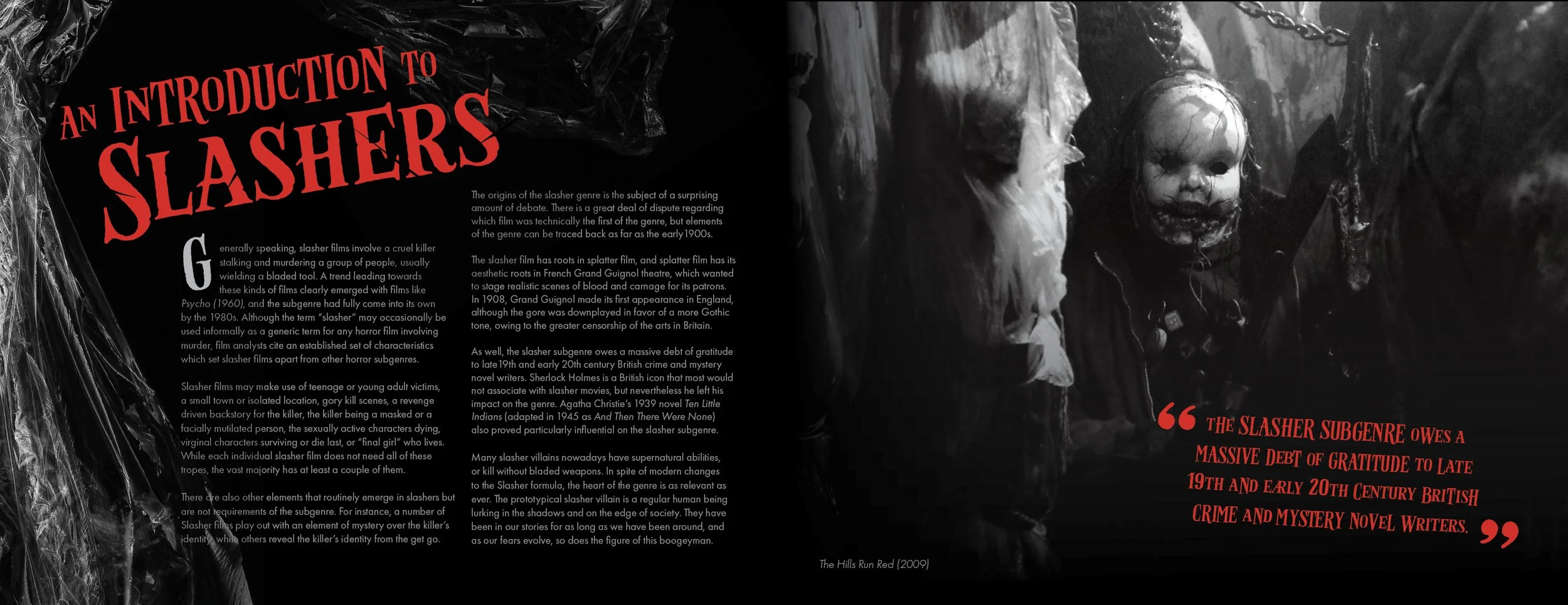
Above: Final cover page and book spreads featuring the Introduction and Giallo sections of the book
Conclusion
This project taught me to think about the linear and narrative experience of engaging with a design, from the way people make their own story as they navigate a museum exhibition to the way they process a book or movie. I now find it useful to look at logos like the first scene of a movie, distilling key information into a single image that will follow the audience throughout their journey into the brand.

