The Toy Garden
Background
The goal of this speculative project was to design a toy store retailer brand while taking into account its ability to grow and expand over time without a designer’s involvement. The theoretical brand was The Toy Garden, which would set itself apart from other retailers by offering a family centered community play space. To meet this objective, I designed an extensive library of assets that are easy for anyone to use and add to, as well as a unique brand book that details how to handle props, mascots, and more.
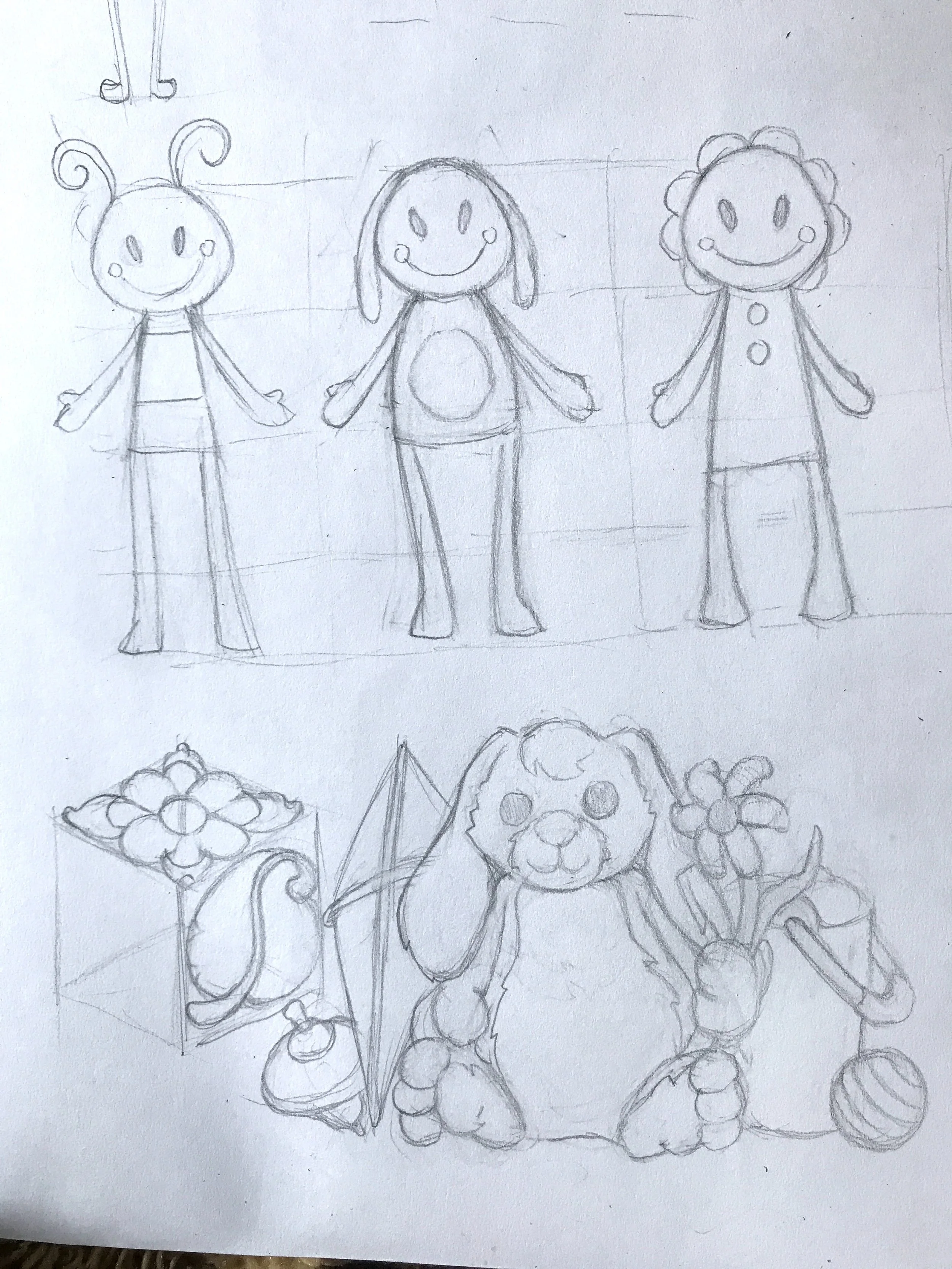
Above: The Toy Garden logo exploration and mascot sketches
Logo Development
An intuitive solution for designing a toy retailer logo is making it attractive to children, so finding a fun visual style for the brand was an early priority of mine. I explored typographic solutions as well as various illustration styles, and struggled for a while to make something that was eye-catching enough to appeal to kids while not overdoing the level of detail. The Toy Garden brand is also intended to appeal to caretakers in order to convince them that its retail locations are suitable for their children, so that needed to be taken into account as well. When my initial designs got too complicated, I was inspired by the styles of children’s brands like Lovevery and Maisonette to make key visual elements supportive of the logo rather than being represented in the logo itself. This solution ensured that the logo would work for both kids and adults, because eye-catching supporting visual elements could be added or omitted as necessary.
Above: The Toy Garden logo initial drafts. These designs had issues like being overly complex, not having a good monochrome variant and not lending themselves to a horizontal variant design
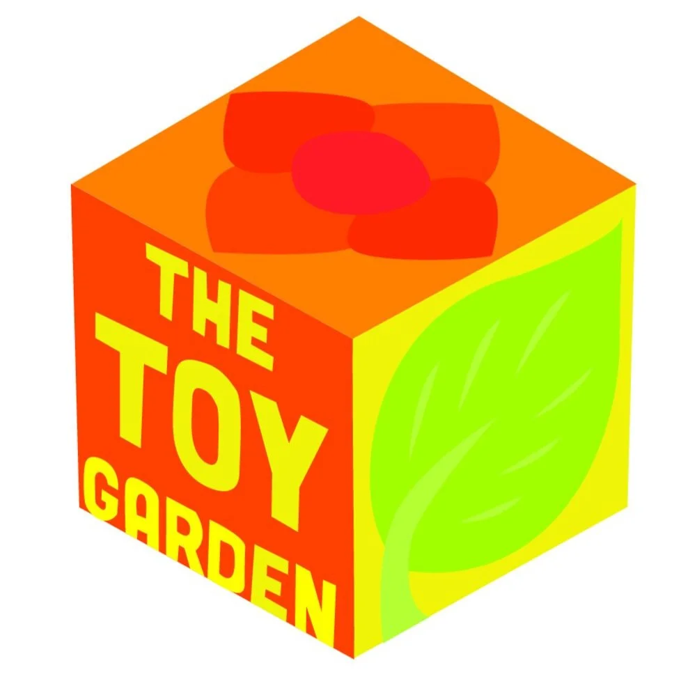
Above: The two final designs. Primary and horizontal logo variations
Pattern Development
The Toy Garden’s primary supportive visual elements can be found in the “Garden Treasures” pattern, which was designed to work as both a print and as illustrated “props” for marketing materials, merchandise, and more. It consists of both natural and toy objects to illustrate the way a child can view everything as a toy, tying into The Toy Garden’s values of creativity and imaginative play. While creating these illustrated items was a straightforward process, finding the right color palette to represent the brand was not. I first opted for a rainbow of colors, but that direction proved too broad and overwhelming. To find the appropriate palette, I went for a nature walk and tried to recall how I looked at things as a child. I remembered how I wanted to pluck flowers off their stems and stones from their piles, seeing each as a little keepsake. I remembered how vibrant colors seemed before I got used to them. I chose a warm, welcoming palette to represent these feelings, to depict the items in a way that would make them appear desirable to interact with.
Above: Early color exploration for the Toy Garden
Above: Final “Garden Treasures” pattern featuring various toys and natural objects with a warm color palette of greens, yellows and oranges
Pattern Usage
The “Garden Treasures” pattern was mainly created to serve as a decorative element for purchased goods. Whether a customer makes a standard purchase, or a gift wrapped present, the brand maintains visual consistency.
Above: Brown paper bag and wrapping paper for The Toy Garden
Brand Book
The Toy Garden Brand Book covers everything from the goals and values of the organization to the tiniest typographic details, but what makes this set of guidelines different from many other brands is that it explains how to compose illustrated scenes, how to color each object in the scene, and even how to draw more elements in the Toy Garden style.
Above: The Toy Garden brand book physical copy mockup
Above: Brand book page spreads showing off the visual guide section of the book unique to The Toy Garden brand
Conclusion
This project challenged me to go beyond designing a brand’s visual identity and to develop a deeper understanding of the details that define a brand, as well as how to explain those details to others who need to work with them. Creating a brand book affected how I approached designing branded materials on every level, and taught me to maintain consistency, simplify procedures, and, in the unique case of this project, create designs that could be easily modified. While I believe that illustrations should be handled according to the unique needs of every project, this project changed how I look at illustrations in a way that is specific to graphic design. Like with choosing a typeface for a brand, I believe brand illustrations should be flexible to fit a variety of usages.


