Holidairy
Background
The idea for this speculative project originated from the thought, “If chocolate milk is basically the same as hot chocolate, then why aren’t other kinds of flavored milk seen as a similar caliber of dessert?” This inspired me to create Holidairy, a flavored milk brand that would entice adults who had grown up drinking milk from lunch cartons to revisit flavored milk and view it in the same way that they would view hot chocolate.
Early Ideas
I did a lot of conceptual sketches exploring different styles for this project. In the end, I went with something that had a retro feel in order to appeal to my audience’s nostalgia. Studying food advertisements from first half of the 20th century, I sought to replicate the tangibility of those illustrations and the desire they provoked to reach into the image and possess what was on display.
Above: sketches exploring illustration styles and label compositions for the Holidairy brand
Illustrations
Normally I would start with developing a logo to determine the core of a brand’s visual identity, but for this project, I developed my illustrated assets before doing anything else. I did this to ensure that the art would be the focal point of the design, so that later elements I would introduce to my designs would not overpower them.
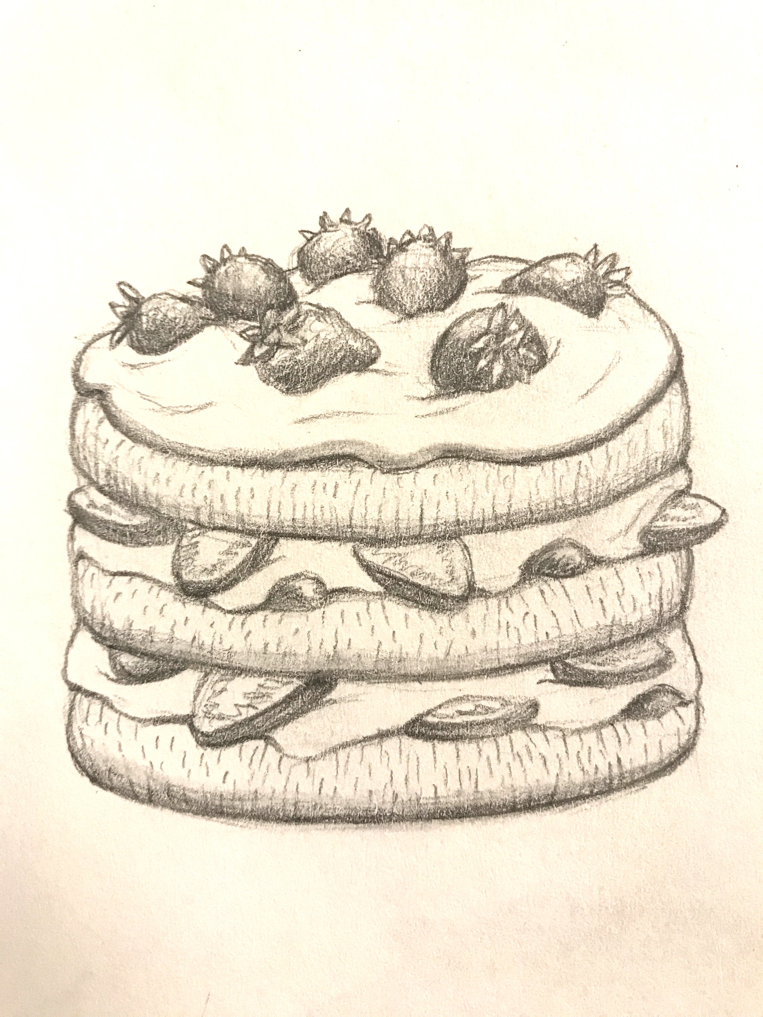
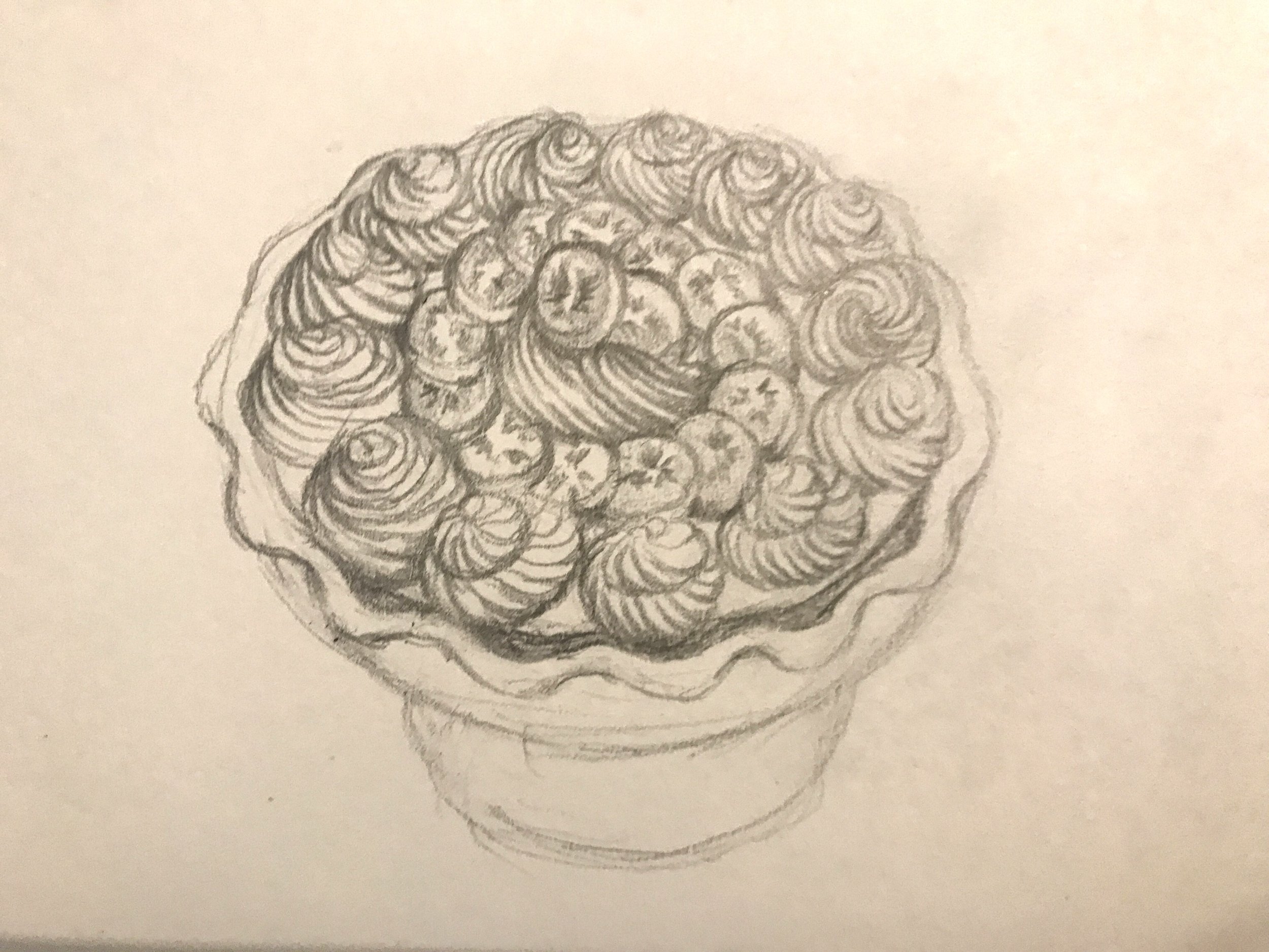
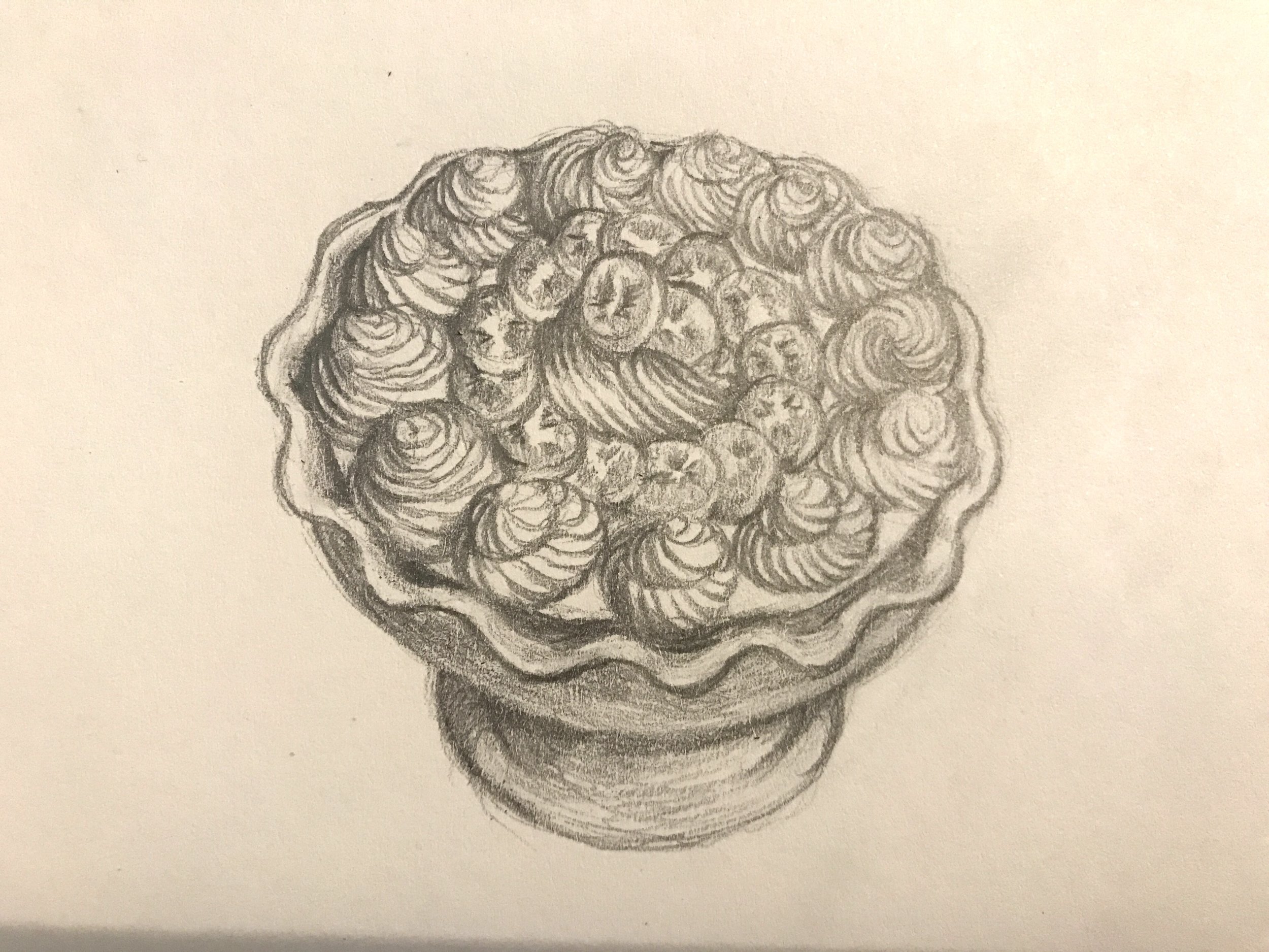
Above: Illustrations of a chocolate cake, bowl of vanilla ice cream, strawberry shortcake, and time lapse photos of a banana cream pie illustration
Initial Drafts
I tried to balance nostalgia with modernity in my early drafts, but it came across as a confused mix of styles. In order to better realize a clear visual style for the brand, I would need to commit to a specific direction, and determine the core characteristics of the brand. I decided that those characteristics were whimsy and nostalgia. I also still needed to find a typographic style that mirrored my illustrations and encompassed my the brand’s core characteristics.
Above: Early Holidairy label design exploration. Modern minimalism is reflected in the sans serif typographic choices and simple geometric shapes incorporated into these graphics
Logo Development
Developing a logo for Holidairy allowed me to refocus the project by finding it's typographic identity. I choose the Huvet typeface because it’s “weathered treasure” style gave me a striking new visual direction to take my illustrations in. The logo takes the basic tropes of milk and chocolate logo design (like featuring banner text) and incorporates a sense of dreamy, creamy whimsy into it with sparkling ribbons and a generous helping of whipped cream.
Above: Holidairy logo evolution. I found ways to highlight my logo typeface by adding a ribbon behind it, incorporating the first “I” in Holidairy into a milkshake illustration, and adding more and more sparkles
Results
Using the logo as my template, I constructed new elements that fit my nostalgia/whimsy theme like a checkerboard pattern and added typography in the style of old milk bottles. I considered using classic glass milk bottles, but after researching their history, I learned that there was a good reason why the milk carton became a more popular option (mostly hygiene).
Above: Product mockups showcasing Holidairy branding on bottles, cartons, and milk powder packages
Conclusion
This project gave me the opportunity to create a brand where the illustrations and typography were highly influential on one another, and I learned the importance of integrating typography into your brand at an early stage of development so that you don’t accidentally spend too much time making something that won’t integrate well into graphic design.
Above: Social media campaign illustration featuring bottles of all four Holidairy flavors: Chocolate Bliss, Vanilla Dream, Banana Delight, and Strawberry Joy


