The Donut Hole
Background
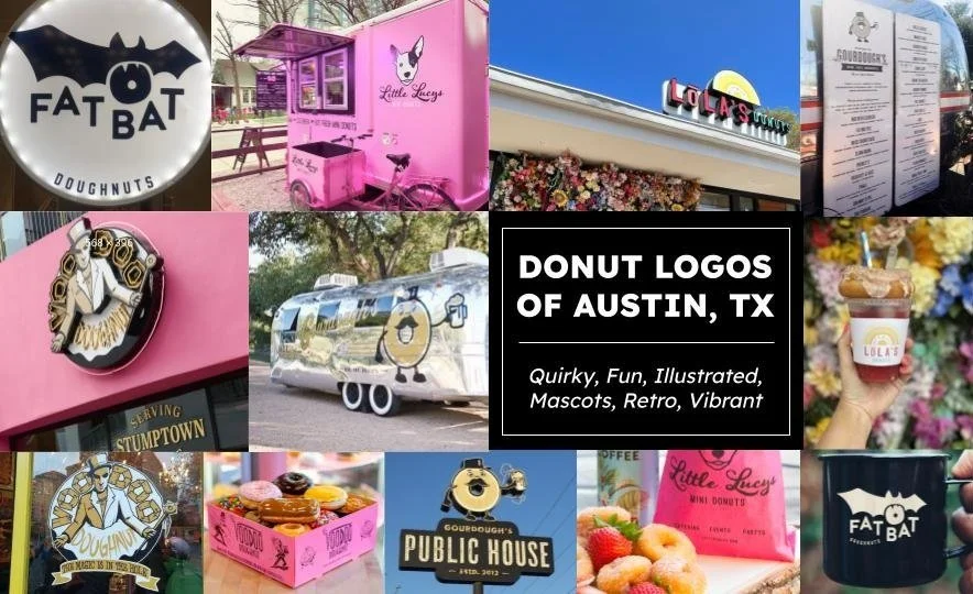
Austin is home to many fun, quirky restaurants, and the Donut Hole is no exception. However, in an era of food trucks and memorable branding helping new small businesses stand out among an increasing number of competitors, my favorite place to grab a donut from childhood to present has not done much to update its image. The purpose of this speculative project was to investigate the spirit of the eccentric restaurant and put it on the map with other must-visit Austin donut shops like Gourdough’s, Little Lucy’s, and Voodoo Donuts.
Logo Development
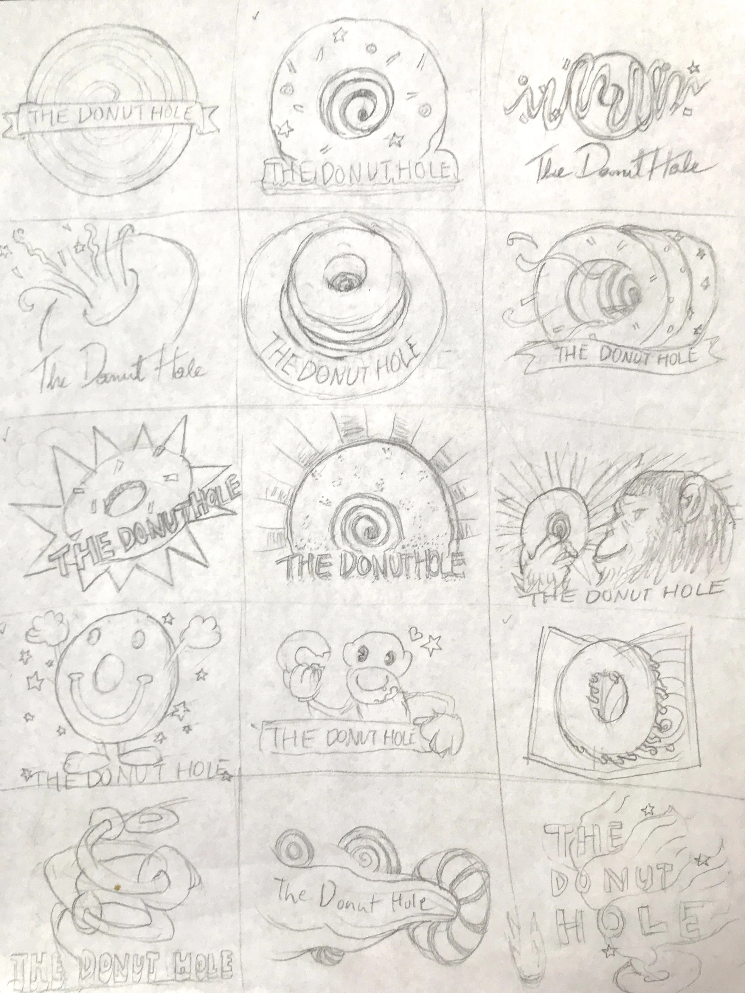
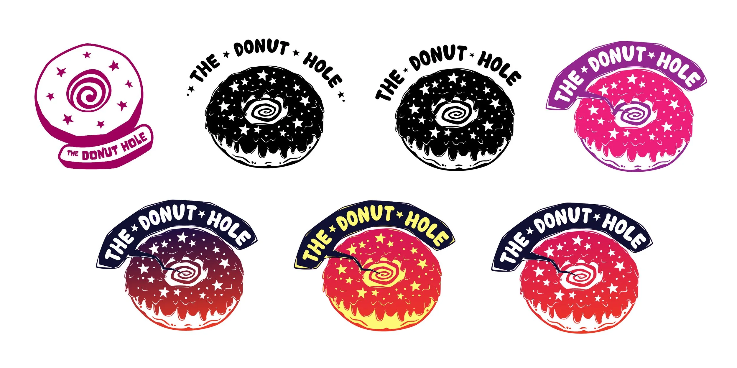
Distinctive illustrated logos are a staple of many popular donut shops in Austin, so my early logo exploration for The Donut Hole focused on sketches more than typography. While thinking of how to emphasize the center of a donut to better reflect the name of the brand, the image of the hole as a gateway to another dimension (“of fun and flavor!”) became a standout motif. I decided to go forward with that idea because a sci-fi and/or psychedelic theme matched the playful eccentricity of the brand.
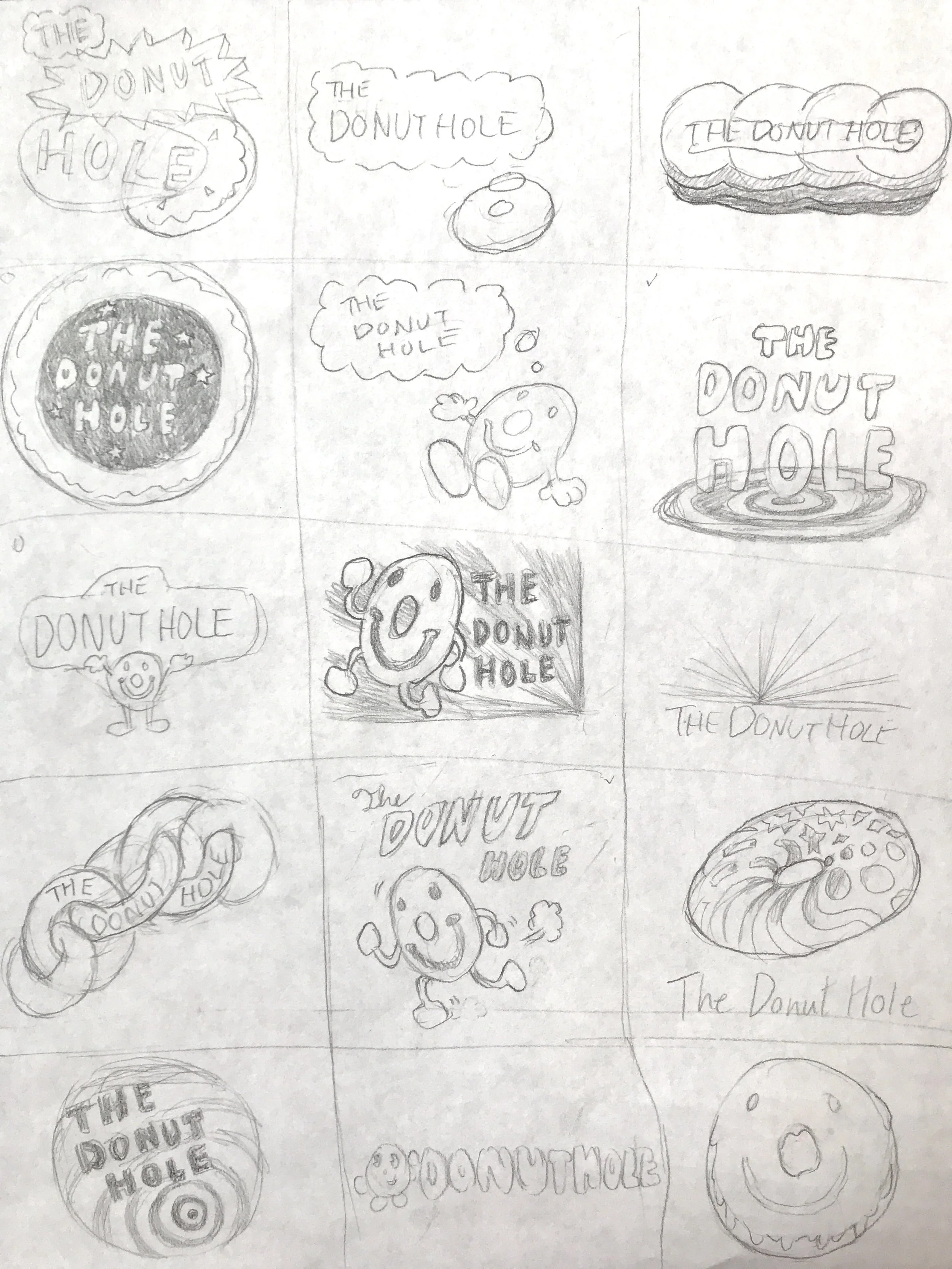
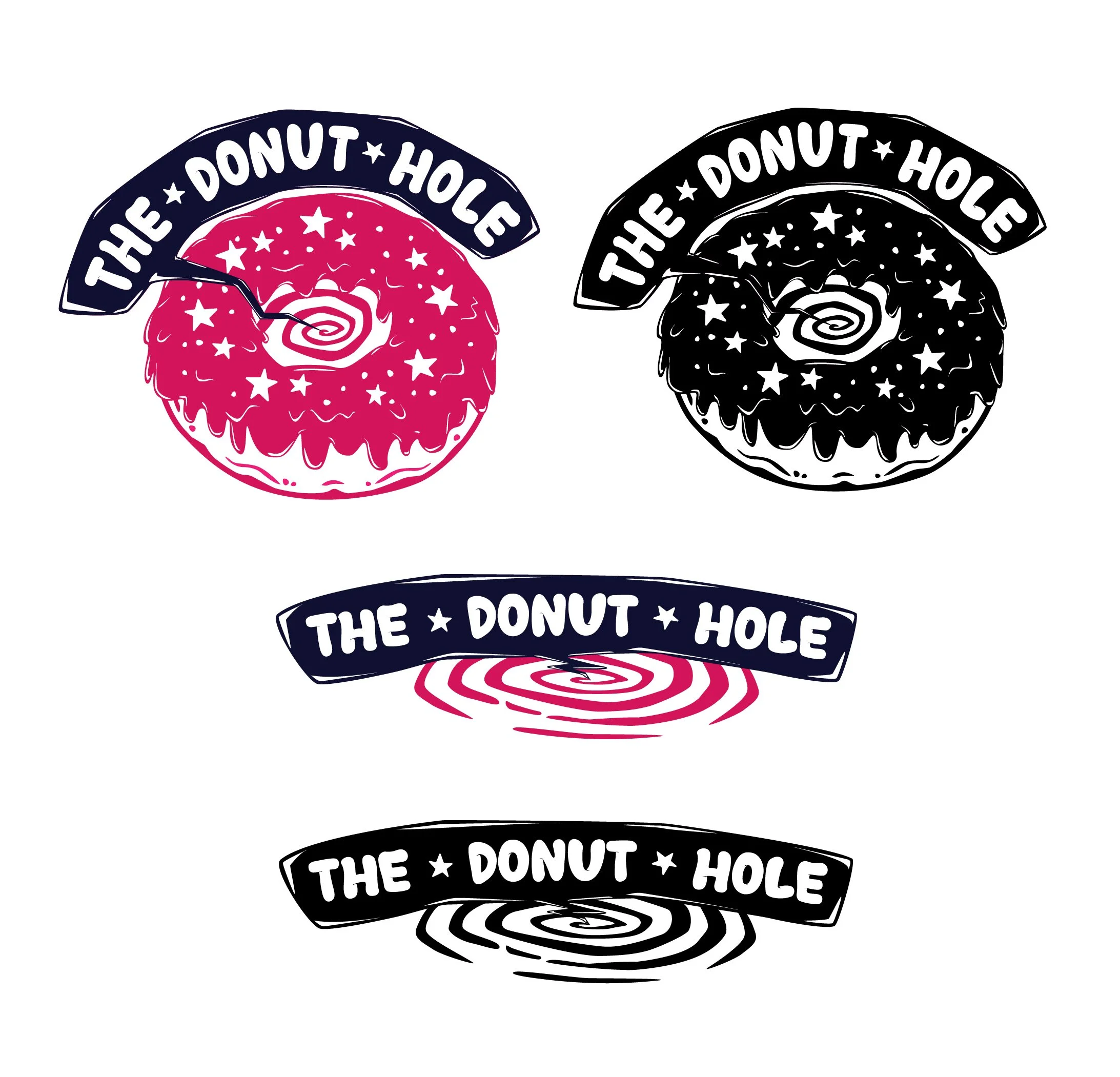
As tends to be the case when I do illustration work for a brand first, I initially struggled with finding a typographic style for my logo. The problem tends to be that it is hard to find a typeface that matches exactly with the pre-established illustration style, so I end up spending time altering the illustration style to better match the typeface. The first typeface I chose ended up making the matching illustrations too “boxy”, so for my next draft I set out to find a typeface that had attributes I could expand on in a donut illustration. I ended up choosing a typeface that had a slightly three-dimensional quality via little lines indicating curves in the letters, and this resulted in an illustration style with a slightly three-dimensional glossy sheen. The only major problem with the logo left after this was determining how to connect the typography with the illustration so that they didn’t feel like separate elements. This was eventually solved by creating an ethereal speech bubble calling from the inside of the donut hole dimension, beckoning customers to come in.
Conclusion
This project was a great example to me of how intrinsic typography can be in graphic design, and is something to keep strongly in mind even if you are designing an illustration-based logo. In this case, typography was important enough to alter the illustration style of the project multiple times.

