Skatefair Roller Rink
Background
Though roller rinks have long been popular community staples for families and especially their children, the turn of the decade has seen a rise in the popularity of roller skating among teens and young adults thanks to the Covid-19 pandemic leading people to explore new hobbies. Roller skating is trendy again, and Skatefair is a representation of that zeitgeist. This speculative project explored the design tropes of entertainment industries to create a brand that is both appealing to standard roller rink demographics as well as a new generation of hobby skaters.
Logo Sketches
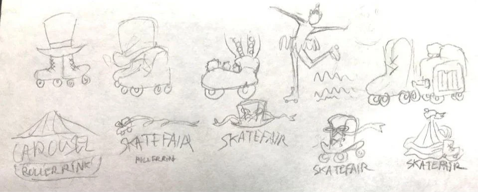
Skatefair is a circus themed roller rink, so it seemed intuitive to me to study the logos of both roller rinks and circuses when it came to designing a logo for the brand. I also reviewed entertainment brands in a general manner, and found that an important factor I would need to keep in mind for my young target demographic was that my design should to be easy to read and understand. My early logo sketches ended up being less like solitary logo ideas and more like scribbled notes as I tried to determine what the most universally understood visual signifiers were for my themes. In the end, those symbols were skates and a big top tent.
Logo Typography
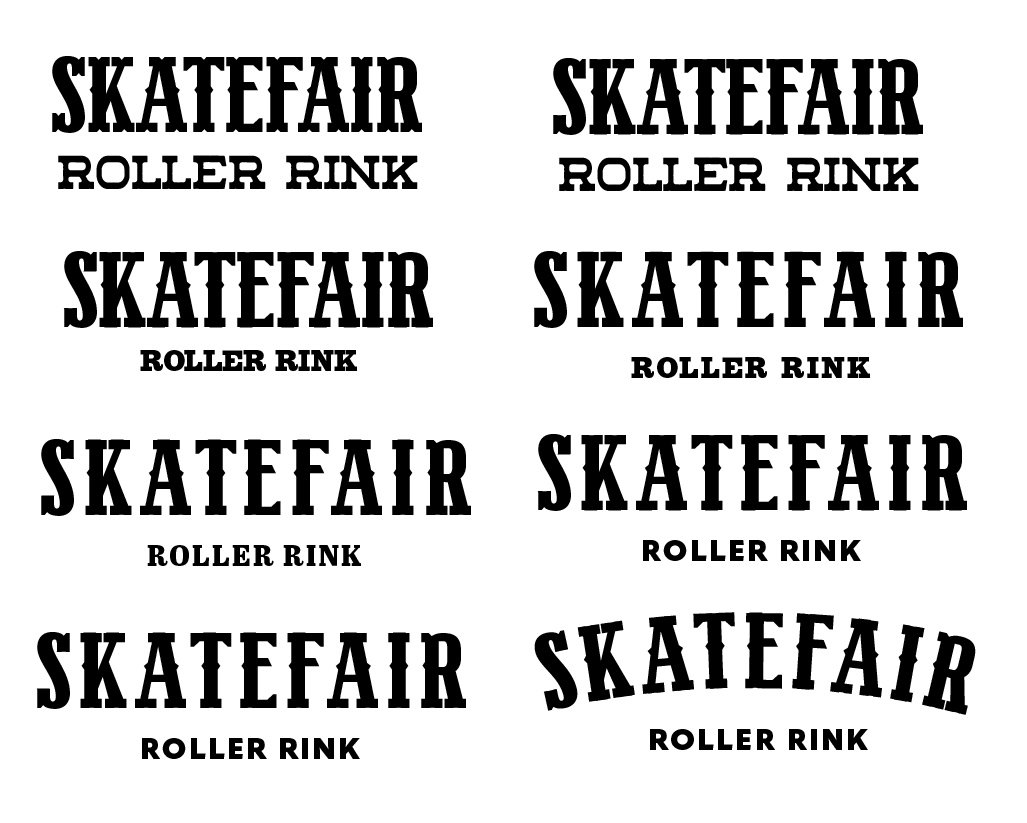
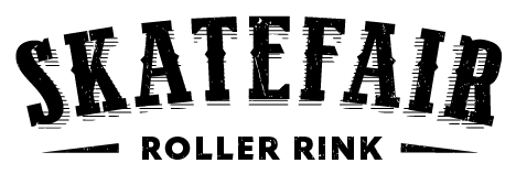
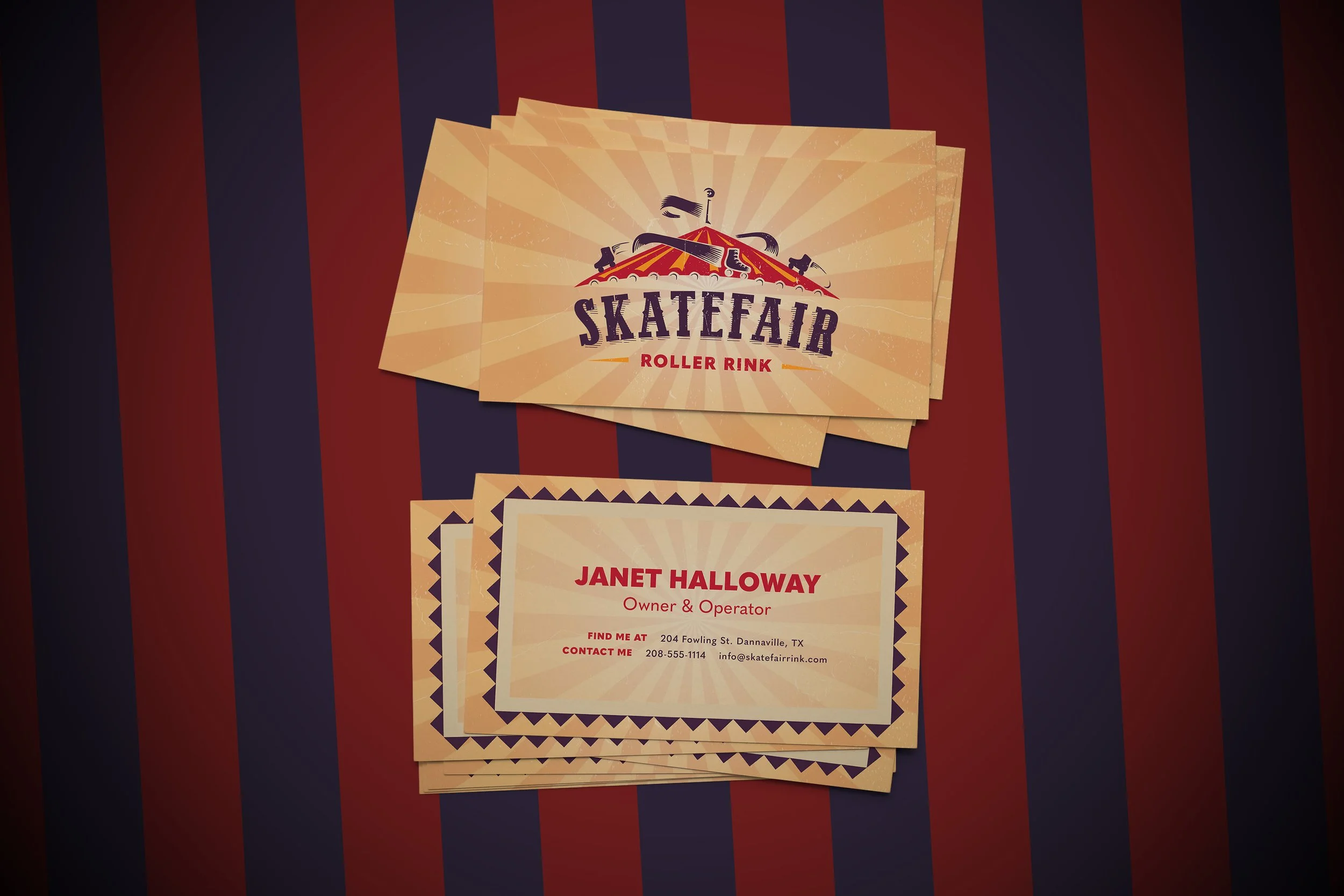
Since the circus theme was typographically much more distinguishable than the roller skating theme, I began to explore circus-inspired typefaces for the my logo. One problem I ran into during this process was that while the typefaces were identifiable, they were not always readable, especially considering that they were largely inspired by the poor design of 19th century typography, which often sought to get attention by adding as many unnecessary flourishes as possible. To make my chosen typeface more legible, I removed some of its decorative indentations and increased the kerning between the letters. This also helped it look more modern, which made it easier to pair with a contrasting sans serif typeface (and also helped associate it with the sleekness of logos for well established family entertainment centers and amusement parks like Main Event and Six Flags). All that was left was to incorporate the symbolic imagery i had decided on. I solved this by putting the name of the rink on a curve, which allowed me to transform it into the sides of a tent or carousel toped off by a stripped tent cover illustration. To incorporate the skate imagery, I came up with the surreal image of skates riding around on the top of the tent. This was evocative of the “flying skate” motif that I found common in skate rink logos in my research.
Conclusion
Skatefair was a good exercise in evoking a retro feel while using a modern design. So many of the examples that I came across in my research, from illustrations to typography, lost the identity of their brand and made it less accessible to their target audience out of a seeming need to adhere to authenticity, where the illustration felt like a separate entity from the logo, and the typography was unmemorable. I feel proud that I was able to recognize these problems and create a logo with an image that is different enough to be distinctive and typography that not only isn’t overpowered by the illustration it is paired with, but can still communicate everything you need to know about the brand when standing alone.


