Horizons
Background
My client needed some help putting together a book that showcased her father’s art alongside her poetry. I have a background in the art world and have always wanted to do a book project for a client, so I came into this project excited to learn more about publication design.
Visual Identity
When developing a visual identity for this project, the omnipresent question was whether we were making an art book or a poetry book. I ultimately went more towards the latter direction after interviewing my client and her father. They had a shared through line of doing away with artistic pretensions and focusing on personal expression of emotions and world views. An image that particularly stuck with me was artist Fred Carvell desiring for his paintings to hang in private homes rather than museums. Making the home the domain of inspiration for this project shifted the aesthetic away from the “blank white art gallery as a book” look towards private collections of notebooks, photographs and personal artwork. We were going to create an informal and intimate world featuring the delightful surprises of searching through a box of keepsakes.
Above: Horizons mood boards
Combining Art with Poetry
A big source of inspiration for this project that I discovered during my research was a biography on the artist Claude Monet. Rather than framing his work in the center of the page, this biography stretched Monet’s paintings to the edge of the page and areas of interest were extracted from his paintings as decorative elements. The book wasn’t containing the worlds of his paintings in designated rectangles, it was giving the reader a lens through which to view Monet’s inner world. The typography assisted with this immersion by styling typographic elements like Monet’s colors and brushstrokes, and the text background highlighted the philosophical aims of Impressionism by abstracting an image to highlight elements of light and color.
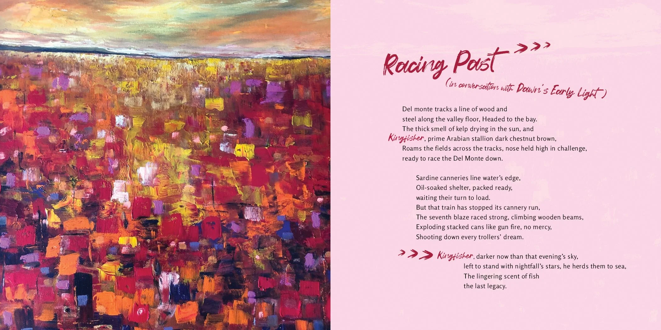
Above: Spread sample from Horizons. Poem “Racing Past” paired with painting “Dawn’s Early Light”
Taking inspiration from the Monet biography, I sought to immerse the reader in the shared inner world of my client poet and artist. There was a “call and response” between the paintings and poems of Horizons, where the right poetry page responded to the left painting as though it were a “painting with words”. Rather than adding a label to a painting, each painting’s title would be announced “in conversation with” the poem’s name. The background image behind the poetry text also emphasized this relationship by being a literal reflection of the painting on the left page.
Above: Spread sample from Horizons. Poem “Day Break” paired with painting “Olives in The Making”
“Day Break” was one of the few exceptions in the book to the “reversed background” rule because it worked better for the composition. Many of the pages, including “Day Break”, included sketch-like illustrated elements that situated the book in the world of a personal journal, and the handwritten script typeface Forturn, used to highlight core words and concepts in the poems, also helped with that impression. The humanist sans serif typeface Rosario was chosen for the body text to add a safe, friendly formality and legibility to the reader’s experience.
Above: Spread sample from Horizons. Poem “Legacy in Tattered Photos” paired with photos of my client’s family
Portraying An Inner World
Not all of my client’s poems paired intuitively with her father’s paintings. For these spreads, I created a black background inner world (to contrast with the bright and polychromatic shared world of both artist and poet) where the poems would be paired with personal objects and textures photographed at my client’s house. These images were abstracted like the artist’s paintings to communicate a creative perspective that carried over from artist to poet, from father to daughter. These unique dark sections were also useful for breaking up the flow of the book.
Above: Spread sample from Horizons. Poem “The Orange Cat With Me” paired with a filtered photograph of hammered patinaed copper
“The Orange Cat With Me” poem broke the “monochromatic inner world” rule because it made for a more engaging composition to switch back and forth between two different colors representing two different perspectives. A gradient of the two colors was used to highlight what is shared between the two perspectives.
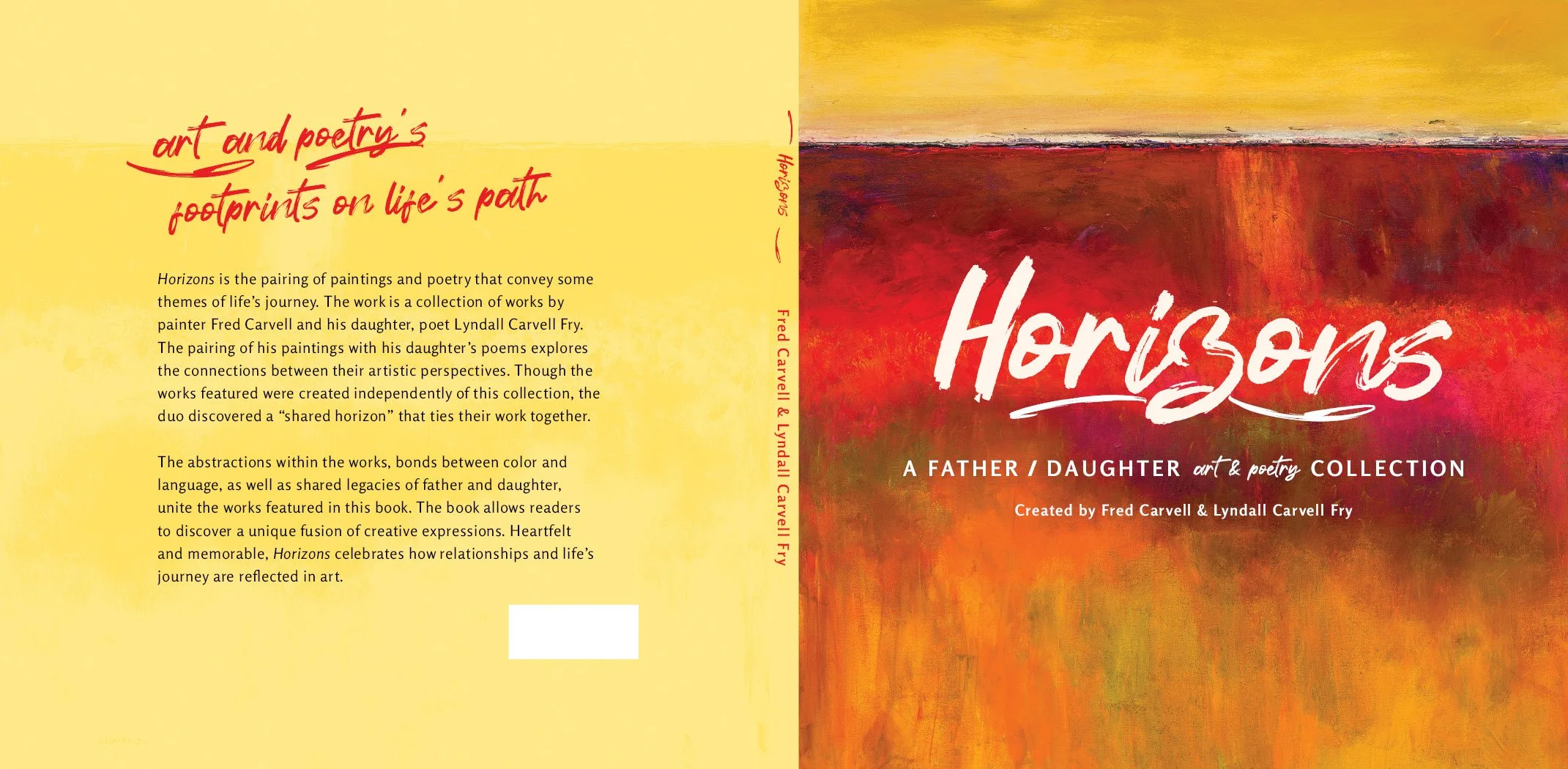
Above: Horizons front and back cover. The underline in the title/logo is split in two on the back cover and spine, representing the two perspectives of the book.
Above: Horizons front cover and painting/poetry spreads in print
Conclusion
This project helped me develop skills for working with a client on a long term project, learn more about the publishing process, and introduced me to the hurdles of larger projects. As more of the book was completed, the time required to implement style and composition changes and make corrections greatly ballooned, and loosing work became much riskier. At one point I realized all of my images were RGB because early on I thought it would not be a big deal to experiment with them in any format, but this later resulted in needing to go back and individually convert most images in the book to CMYK, which was a massive time sink and it resulted in having to overhaul some of the poetry background images. There are several things I now know to look out for regarding organization and procedure when it comes to doing projects of this size in the future.
Notice: Copyright © 2025 Lyndall Carvell Fry. All rights reserved. Neither this book, nor any parts within it, including art work, design work, or poetry, may be sold or reproduced in any form without permission.


